Gather round, friends, and listen to the story of how a woman nearly lost her mind while tweaking her website design.
On second thought, perhaps I'll spare you the bulk of those details. Just know that it got all sorts of crazy up in here. Curses were uttered. Tears were shed. Teetering on the verge of a mental breakdown was a familiar reality. Boy, did it get rough at times, but it was all worth it in the end. Seriously, it was!
I want to take some time today to tell you all about the exciting features in this brand spankin' new blog design (and why they were worth all of the stress to implement), as well as about the cool things we have in store for you lovely Toast-Hosts in the future. But first, let's take a glimpse into the past.
2o12
I've been chronicling my recipes here on the Host the Toast blog for nearly four years now. Four! Wild right? Although I've loved Host the Toast for all of that time, I've never been crazy about the site's appearance.
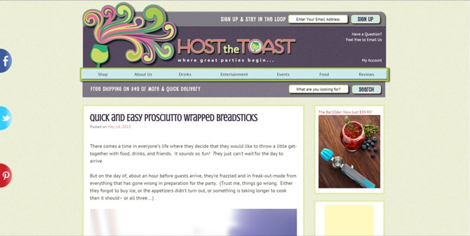
Back when we first launched the Host the Toast blog, it was paired with an experimental side-store of Kitchen Kapers, which was called-- you guessed it-- Host the Toast. The blog site featured the same ultra-colorful header as the store site, and the layout followed suit. I loved the fact that it wasn't at all a dull design, but all of the colors, swirls, and different fonts were drawing the focus away from the main content of the blog.
I quickly learned that it's crucial that the layout doesn't compete for attention with your posts. The goal of a good blog layout should be to highlight your content, not overwhelm it.
Check out this screenshot of the original homepage:
It all felt very "groovy, baby."✌️ Don't you agree?
2014
In 2014, we decided to switch focus and turn the Host the Toast blog into the official Kitchen Kapers' blog. Knowing that we wanted to eventually re-brand the blog site, we decided to switch to a bare-bones blog theme. We used the genesis framework and the foodie / foodie pro child themes to keep things clean and customizable.
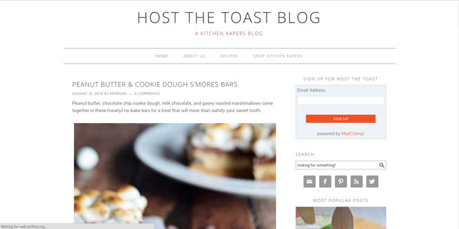
We could sweetly call it "minimilistic", but really it was just Boring with a capital "B". Like I said above, it was meant to be plain at first. But as time went on, it seemed that this blank canvas would be in place for a lot longer than expected. A lot, lot longer.
Eventually, I realized that a bland blog is just as bad, if not worse, than an overly busy one. A forgettable blog design sends the signal to readers that you have a forgettable blog altogether.
Thanks for sticking with us through that rough design patch, pal.
2015
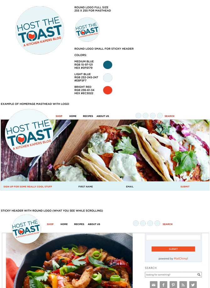
In 2015, Kitchen Kapers' talented graphic designer and marketing guru, Frankie, mocked up a few potential new colors and logos for Host the Toast. I learned that a good logo should be simple, adaptable into a variety of sizes and shapes, and should avoid gimmicky fonts. Bonus points if you can easily turn it into an icon!
We fell in love with this logo, with its light blue, dark blue, and red-orange color palette:
But there was still so much to do before we could implement the logo on the actual site. Instead, we changed the logo on our social media sites and worked ridiculously hard to get the redesign finished.
2016
After 14 months of working on the redesign in the shadows, pulling my hair out, threatening to set my computer on fire, and basically harassing all of my friends who have any inkling about web development, I finally rolled out the redesign. (By the way, the redesign is a totally tweaked version of the foodie pro child theme from before! You can do wonders with it.)
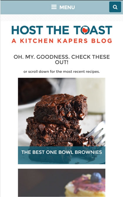
In those 14 months, I learned that having a blog that's mobile responsive isn't enough. With an average of more than 50% of blog traffic coming from smartphones, a blog needs to be designed with mobile in mind from the get-go.
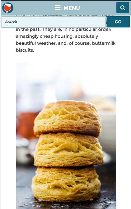
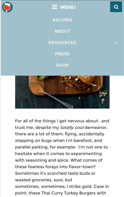
Now, my biggest complaint with most mobile websites is that they're a pain to navigate. The sidebar content is typically pushed to the bottom, which means that you've got to do a lot of scrolling and searching to find your way around. To make sure that readers of Host the Toast can always find exactly what they want, I decided to incorporate a stickied navigation bar into the site design. This way, no matter how far someone scrolls down on a page, they can still access the menu, search bar, and home button so they can get where they need to go.
Tap the search icon and the search bar expands, no matter where you are on the site!
Or tap the menu icon and all of the menu options will drop down.
Oh, and tapping the wine glass icon in the top left corner will take you back to the home screen. Easy, right?
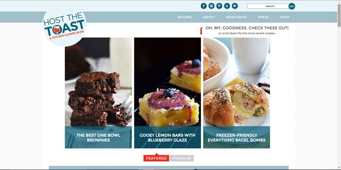
It's just as intuitive on desktop.
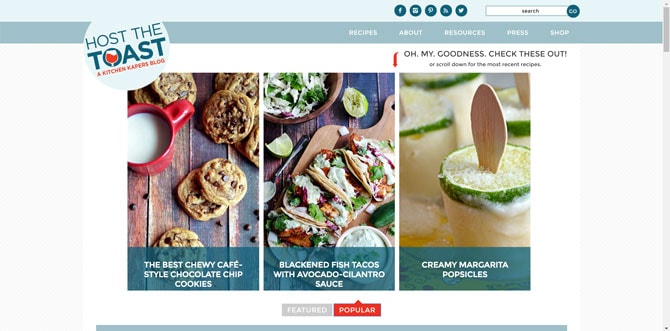
By the way, one of my favorite features of the desktop layout is the featured post carousel. As Host the Toast grows, it's easy for some of the past content to get lost or forgotten with time. I've realized that one of the great things about food blogging is that recipes (pretty much) never become irrelevant-- a recipe that I love today will most likely still be a recipe I love in 5 years. So to highlight some of my past faves, I've decided to start up weekly features of recipes that I think you'll enjoy but might have missed.
You can also press the "POPULAR" button to toggle to the recipes that other readers have been enjoying lately.
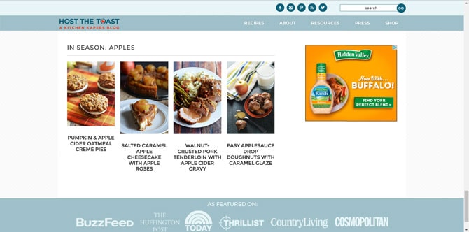
And because I want to make the most of recipes you might have missed (or maybe you did see them, but not at the right time), I also decided to make an "In Season" section at the bottom of the homepage.
I'll use this section to focus on seasonal recipes that feature a certain ingredient. Hopefully it will give you some inspiration as you're stocking up at the farmers market, loading up at the grocery store, or stuffing your harvest picking bag.
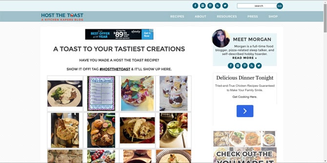
Of course, you'll also often find recipes in the space between, which shows recent posts to the blog. You can also find them on the recipes page, or check out what other people are making by going to the new "You Made It" page, located under the "Resources" tab.
The You Made It page makes it possible to show your versions of Host the Toast recipes off right here on the site, so don't forget to tag your photos with #hostthetoast on Instagram. This is just the first of a whole bunch of ways we're hoping that we'll be able to encourage Host the Toast readers to begin sharing their own creations.
That's right, there's more to come!
But before I go any further, I have to give the hugest of all huge thank yous to some super special people who both saved my sanity and made the design as it is possible. It didn't take long into the redesign for me to figure out that I couldn't do it on my own.
I owe a gigantic thank you to my friend and fellow blogger, Monty, who is responsible for so much of the work that went into this site. He is truly a wordpress genius, and without him, my favorite features of the new site would never have come to fruition. I can't recommend him enough to those of you who are thinking about rolling out a redesign of your own. Check out his site here.
I also want to thank my brother, Mark. Mark was incredibly patient with me as I bombarded him with never-ending coding questions in the past year. He taught me so much and was a huge asset in making the new layout a reality. Take that, sibling rivalry cliché!
Thanks also to Kyle McArdle, who should have just blocked me after the first month of me bugging him, and to the folks over at 99 Robots who hooked me up with some awesome plugins (which I highly recommend and will talk more about in the future).
Speaking of which...
The Future
Though we're ecstatic with the current layout, there are still so many ideas we want to implement down the line.
We're eager to fill the "Resources" section with... well... resources! Resources for home cooks, resources for amateur food photographers, resources for bloggers, and everything in-between. We want to share, in detail, all of the lessons that I learned throughout not only the redesign process (yes, there are more... a lot more), but also throughout my whole time as a blogger and cook. Look forward to helpful tips on food photography (from both your camera and your cell phone), conversion charts for baking, advice for aspiring bloggers, kitchen hacks, and more.
We're also looking forward to creating unique content for our email subscribers. I sure think that our regular readers deserve a little something extra from time-to-time, don't you? It might take some time to figure out, but it's definitely on our list.
Most of all, we plan to continue implementing new ways to make the blog more personalized to your tastes. That means constantly tweaking the site to make Host the Toast as great as it can be for you, the readers. After all, there would be no Host the Toast without you.
And since it truly is all about you, please let us know what you think about the redesign. I'd love to hear your suggestions about where we should go from here.



James says
Morgan-- I am so proud of you! The new layout looks awesome! It's clear that you put your whole heart and soul into the redesign over the last several months; your horde of skills and talents are absolutely reflected within it. Can't wait to see what's next for the site.
Good luck!
- your (handsome) taste tester
Joyce says
Wow...I love the new design! Very easy to use and the food presentation is perfect. Thank you for all your (and others) hard work.
Jessica says
I love the new site, but how do I find your old recipes? It's officially October and I NEED your red pepper and italian sausage risotto!
Morgan says
The old recipes are in the same places they always were =) You can find them by using the search bar or looking through the recipe page. I don't think I have a risotto recipe, but I do have a one pot red pepper and italian sausage pasta, if that's what you're thinking of! https://hostthetoast.com/one-pot-roasted-red-pepper-and-sausage-alfredo/
Kate says
So great! I'm sure you've gone through a lot of nail biting but the blog looks amazing! Great work!!